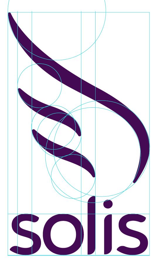
solis

A smartphone app providing resources, support, and hope to the family and friends of suicide attempt survivors.
Branding and Visual Identity, ui/ux, social design
safe
informative
uplifting
The Project
After an experience that left me searching for resources and answers, I discovered the need for a better source of support for the family and friends of suicide attempt survivors.

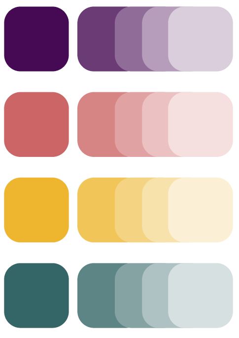
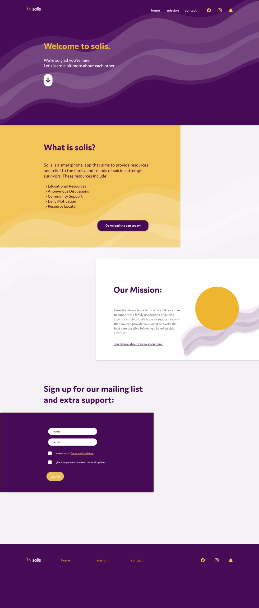
This project includes the visual identity, marketing materials, and prototype for a smartphone app that provides resources, support, and hope to its target audience.
The Approach
Solis seeks to provide a safe, educational environment for its audience through careful selection of healing colors, soft and smooth edges, and simplified informational resources.
The Logo
The colors
Violet: Used in chromotherapy to help reduce pain and suffering through relaxation.

Coral: Symbolizes life, helps to restore harmony, and encourages cognitive brain function by generating energy.

Gold: Used in color therapy to energize and encourage action. Symbolizes light and warmth, as from the sun.

Teal: Said to be a healing combination of green and blue. Associated with wisdom, strength, hope and serenity.
Website/Landing Page
brittnvnski.design@gmail.com